
Building a beautiful Power Apps mobile navigation menu - Components (part 4)
You’ve made it to Part 4! 🤩In today’s blog post, we will focus on wrapping up all of the work you have done so far into a component.
Why would you need to use components? You might already know that developers don’t re-write every line of code from scratch, and neither should you build everything from scratch for your apps - if you’ve put hard work into building something, you’ll want to use that for future project and customise it.
Components allow you to build reusable parts such as navigation menus, headers, date pickers, forms etc. - you name it. After you’ve added a component, and you decide to change something in the source ‘code’ - colour of the text, font size or anything else - this will update the component across all of your screens. If you had a group of controls in each screen, you’d have to update each one of those groups manually which is not only tedious, but also unmanageable. The other huge advantage of components is that you can easily export them and import them into your future apps, and even better - add them to your Component Libraries (which have just gone GA [General Availability]) for any maker in your organisation to reuse them. Cool, right?
Let’s dive right into building one! To the left side of your screen, click on the ‘Components’ tab, and then ‘+ New Component’.

We will now be greeted with the Components canvas. It works exactly the same as the Screens canvas with the additional ability to assign Custom Properties (which we will cover shortly).

Let’s get the progress we’ve made so far into our component first - to do so, please navigate back to your Screens tab, copy one of the groups and paste them into your component. I’ve created a quick GIF to show you how to do it.

Once we’ve done this, we will get some errors. This is because our navigation menu is still referencing screen/app specific values - nothing to be worried about, we will be fixing this throughout this post!
You’ll remember from our previous posts that we have updated some of the properties within the Gallery, SVGs and Icons to behave the way we want. Here’s a list of them:
Icon colour - for the current screen, we want the icon to be blue, and for all other screens, we want them to be grey.
Type of icon - whether we’d like to use SVG’s or out-of-the-box icons.
SVG colour - just like the icon colour, this one is applicable if you have followed my previous blog post and are using SVG’s. The reason why we have to make this a separate property is SVG’s cannot accept colour values directly from a colour picker - they have to either in HEX format or rgb format.
Gallery items - we have added a table of menu items to the gallery such as screen name, navigation screen etc.,
SVG animation - similarly to the SVG colour, we want the icon for the current screen to ‘float’ and the other icons to be static.
Colour of the background menu
These will be our component properties.
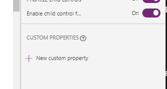
Let’s start with the Icon colour. Click on ‘+ New custom property’ and then define the following:
Display name - this is what the maker will see in the properties panel,
Name - this is the name that will be used to reference in controls/app - it cannot contain spaces or special characters. I tend to give the same name to Display Name and Name (without spaces) for ease.
Description - this is to help you and other makers using your components identify what the property will be responsible for.
Property type - there are two types of properties - input and output. Input allow you to add values that will then be reflected in the component. Output properties allow you to provide some output - value, table, calculation etc. - back to your app. For today’s component, we will only be using output properties.
Data type - this is what we want to actually input into the component (colour, text, image etc).
Your properties pane should look like the screenshot below. Please click ‘Create’ to add it to your app.

Time for our second property - SVG colour. As the SVG will only accept HEX and rgb values in Text format, we need to add - you guessed it right - a Text property to our component. Feel free to give them any name, display name and description that you’d like - just make sure that Property Type is set to ‘Input’ and that Data Type is set to ‘Text’. Click Create.

Time for Gallery items. As we have defined the items using the Table() function, we need to add … a Table component. This is so simple, right?!

For SVG animation, we are going to use a Boolean property. This is because we will be using an If() statement to specify if we want animation or not, which only has two values - true or false.

The next property will be the type of icon. We will make this a boolean value - if a user sets the toggle to ‘true’, it will be SVG’s, if it’s ‘false’ - out-of-the-box icons.

And lastly, let’s add the property for the background colour of our menu. As we are again using code, we will not be able to pass the colour using the colour picker. The property will look exactly like our SVG colour property and we will be using Text as our data type.

Before we proceed any further, let’s rename our component! I’m going to call it NavMenu but please feel free to give it any other creative name you like!

Firstly, let’s ungroup all of the items. Please click on the ellipsis (…) next to the group, and click ‘Ungroup’.

Let’s start adding some values to our component properties. Click on ‘NavMenu’ from the left pane, and navigate to MenuItems property. Here we will want to paste the items from our Gallery - you can either go to the Gallery and then Items property, or simply copy from the snippet below.
Table
(
    {
        ScreenName: "Home",
        Navigation: Home,
        MenuLogo: Icon.Home

    },
  {
        ScreenName: "Settings",
        Navigation: Settings,
        MenuLogo: Icon.Settings
    }
    ,
    {
        ScreenName: "Profile",
        Navigation: Profile,
        MenuLogo: AddUser

    }

)

Before we do this for all other properties, let’s test it in action! Click on the Gallery and navigate to the Items property. As our gallery items will now be dependent on the MenuItems property we added to our component earlier - we no longer hard code the items here, we just reference the MenuItems property. The formula should look like this:
ComponentName.PropertyName
In our instance, this will be NavMenu.MenuItems. Place this in the Items property of your Gallery and let the magic happen! Your menu items should be back in the gallery.

Let’s carry on assigning values. The next one on our list is IconColour. If you select the icon from the left menu pane, and navigate to the Color property - you’ll remember that we have the following code in there:
If(ThisItem.ScreenName = App.ActiveScreen.Name, RGBA(0,98,169,1), RGBA(96,96,96,1))
As we are now referencing the colour of the icon (when the screen is active) directly via the component, we will just need to amend our code slightly:
If(ThisItem.ScreenName = App,ActiveScreen.Name, NavMenu.IconColour, RGBA(96,96,96,1))
If you wanted to be able to define the ‘inactive’ icon through the component too, you’ll need to add a new property to it - let’s call it InactiveIconColour - so that it can be defined dynamically, For the purposes of this post, we will stick to just IconColour, but here’s an example of how the code would look:
If(ThisItem.ScreenName = App,ActiveScreen.Name, NavMenu.IconColour, NavMenu.InactiveIconColour)

Now time for the SVG colour. As we already did the hard work in the previous post, this one will be easy too! Please navigate to the Image control in our Gallery where all of the code is. Your code should look like this:

The only part we need to adjust is the formula next to the fill property. The code itself will have a minor change where we reference the colour of our SVG through the component, as opposed to it being hard coded:
If(ThisItem.ScreenName = App.ActiveScreen.Name, NavMenu.SVGColour, "#9f9f9f")
Don’t forget that we have three different SVG’s within the code snippet. You’ll need to update the other two lines further down in the code too. For ease, here’s the completed snippet:
"data:image/svg+xml;utf8, " & EncodeUrl( "

" &
Switch(
       ThisItem.ScreenName,
"Home",

"<svg xmlns='http://www.w3.org/2000/svg' width='16' height='16' fill=' "& If(ThisItem.ScreenName = App.ActiveScreen.Name, NavMenu.SVGColour, "#9f9f9f") &" ' class='bi bi-house-fill' viewBox='0 0 16 16'>

  <path  fill-rule='evenodd' d='m8 3.293 6 6V13.5a1.5 1.5 0 0 1-1.5 1.5h-9A1.5 1.5 0 0 1 2 13.5V9.293l6-6zm5-.793V6l-2-2V2.5a.5.5 0 0 1 .5-.5h1a.5.5 0 0 1 .5.5z'/>

  <path  fill-rule='evenodd' d='M7.293 1.5a1 1 0 0 1 1.414 0l6.647 6.646a.5.5 0 0 1-.708.708L8 2.207 1.354 8.854a.5.5 0 1 1-.708-.708L7.293 1.5z'/>

  <animateTransform attributeName='transform'
        type='translate'
        values='"& If(ThisItem.ScreenName = App.ActiveScreen.Name, "0 0;0 3;0 0","0 0;0 0;0 0") &" '
     dur='1s'
	repeatCount='indefinite' />
</svg>  ",

"Settings",

"<svg xmlns='http://www.w3.org/2000/svg' width='16' height='16' fill=' "& If(ThisItem.ScreenName = App.ActiveScreen.Name, NavMenu.SVGColour, "#9f9f9f") &" ' class='bi bi-gear-fill' viewBox='0 0 16 16'>

  <path d='M9.405 1.05c-.413-1.4-2.397-1.4-2.81 0l-.1.34a1.464 1.464 0 0 1-2.105.872l-.31-.17c-1.283-.698-2.686.705-1.987 1.987l.169.311c.446.82.023 1.841-.872 2.105l-.34.1c-1.4.413-1.4 2.397 0 2.81l.34.1a1.464 1.464 0 0 1 .872 2.105l-.17.31c-.698 1.283.705 2.686 1.987 1.987l.311-.169a1.464 1.464 0 0 1 2.105.872l.1.34c.413 1.4 2.397 1.4 2.81 0l.1-.34a1.464 1.464 0 0 1 2.105-.872l.31.17c1.283.698 2.686-.705 1.987-1.987l-.169-.311a1.464 1.464 0 0 1 .872-2.105l.34-.1c1.4-.413 1.4-2.397 0-2.81l-.34-.1a1.464 1.464 0 0 1-.872-2.105l.17-.31c.698-1.283-.705-2.686-1.987-1.987l-.311.169a1.464 1.464 0 0 1-2.105-.872l-.1-.34zM8 10.93a2.929 2.929 0 1 1 0-5.86 2.929 2.929 0 0 1 0 5.858z'/>
 <animateTransform attributeName='transform'
        type='translate'
        values='"& If(ThisItem.ScreenName = App.ActiveScreen.Name, "0 0;0 3;0 0","0 0;0 0;0 0") &" '
     dur='1s'
	repeatCount='indefinite' />
</svg>",

"Profile",

"<svg xmlns='http://www.w3.org/2000/svg' width='16' height='16' fill=' "& If(ThisItem.ScreenName = App.ActiveScreen.Name, NavMenu.SVGColour, "#9f9f9f")&" ' class='bi bi-person-fill' viewBox='0 0 16 16'>

  <path d='M3 14s-1 0-1-1 1-4 6-4 6 3 6 4-1 1-1 1H3zm5-6a3 3 0 1 0 0-6 3 3 0 0 0 0 6z'/>
 <animateTransform attributeName='transform'
        type='translate'
        values='"& If(ThisItem.ScreenName = App.ActiveScreen.Name, NavMenu.SVGColour, "#9f9f9f") &" '
     dur='1s'
	repeatCount='indefinite' />
</svg> "
) &"

")
Similarly to IconColour, if you wanted to, you could have two different SVG properties - one for active icon, one for inactive icon. For today’s demo, we will stick with just one value.
As we have a small circle underneath the icon when we are on the active screen, we need to make sure that it matches our icon colour. To do this, please click on the circle in our gallery, and navigate to the fill property. This was previously set to MenuIcon_Color, and we want to make sure it matches the icon. We can leave it as it is, but I’d suggest to reference the icon colour property in your component.

Now, let’s tackle the SVGorIcon property. Previously we manually set the visibility of one or the other to be false/true, and here we will let the component do it for us based on the toggle. Please navigate to the Image control where our SVG code is located, and set the Visible property to:
If(NavMenu.SVGorIcon = true, true, false)
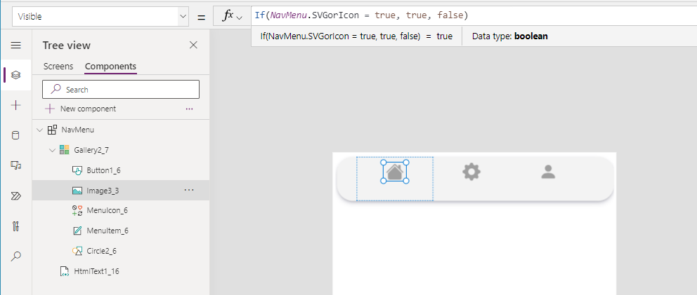
Effectively, if the toggle of the component is set to true, the SVG will be visible (and the out-of-the-box icon will be invisible), if it isn’t - the SVG will be invisible, but the out-of-the-box icon will be visible.
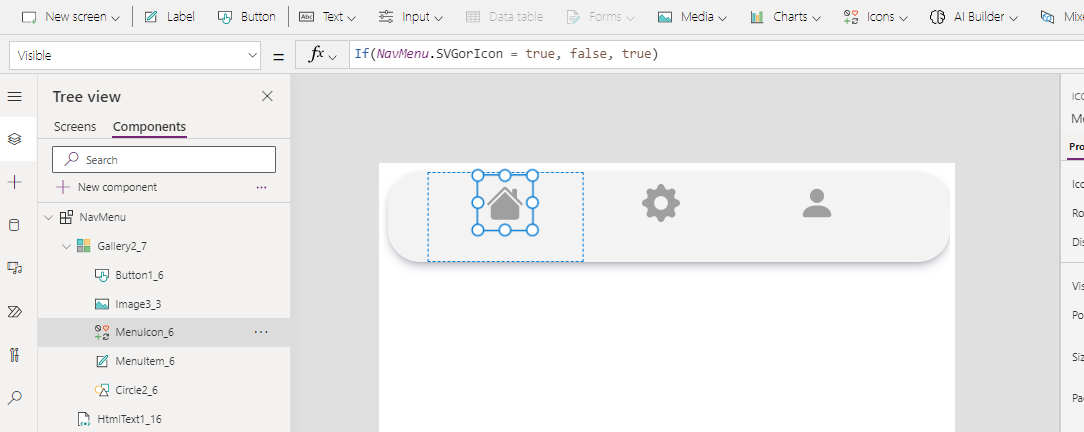
We need to do something similar for the icon itself. Please click on the MenuIcon in our Gallery and navigate to the Visible property. In here, we can either set the visibility to be the opposite of our SVG, or reference the toggle. If you wanted to use the first method, your code would be:
!ImageName.Visible
If you wanted to reference the component toggle:
If(NavMenu.SVGorIcon = true, false, true)
Now, let’s sort out the animation toggle. For this, we will need to revert back to our SVG code - please navigate back to the Image control and the image property of the control. You’ll remember from the last blog post that our animation is dependent on the active screen of our app.
The behaviour we want to achieve is - if the toggle is set to true, we want the icon to float, if false - we want it to be static. To do this, we will need to add another line of PowerFX outside of the <animateTransform>. I’ve outlined the changes below with some colour coding and comments to make it easier to understand what we are doing:
" & //adding a new formula to our code
If( NavMenu.SVGAnimation = true, //our formula starts here
" //don’t forget to add double quotes here - if the toggle is true, we want this line of code to be here, if it isn’t - we want this part to be blank
<animateTransform attributeName='transform'
type='translate'
values='"& If(ThisItem.ScreenName = App.ActiveScreen.Name, "0 0;0 3;0 0","0 0;0 0;0 0") &" '
dur='1s'
repeatCount='indefinite' /> " //end of first part of our If() statement ,
"" //if the toggle is set to false, we want this part to not have any code
) //closing off the If() statement
&" //closing off the reference in the code
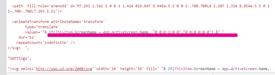
Please don’t forget that we need to do this for every part of our SVG code - similarly to how we did the SVG colour - as we have three icons there. Here’s the complete snippet:
"data:image/svg+xml;utf8, " & EncodeUrl( "

" &
Switch(
       ThisItem.ScreenName,
"Home",

"<svg xmlns='http://www.w3.org/2000/svg' width='16' height='16' fill=' "& If(ThisItem.ScreenName = App.ActiveScreen.Name, NavMenu.SVGColour, "#9f9f9f") &" ' class='bi bi-house-fill' viewBox='0 0 16 16'>

  <path  fill-rule='evenodd' d='m8 3.293 6 6V13.5a1.5 1.5 0 0 1-1.5 1.5h-9A1.5 1.5 0 0 1 2 13.5V9.293l6-6zm5-.793V6l-2-2V2.5a.5.5 0 0 1 .5-.5h1a.5.5 0 0 1 .5.5z'/>

  <path  fill-rule='evenodd' d='M7.293 1.5a1 1 0 0 1 1.414 0l6.647 6.646a.5.5 0 0 1-.708.708L8 2.207 1.354 8.854a.5.5 0 1 1-.708-.708L7.293 1.5z'/>

" & If(
            NavMenu.SVGAnimation = true,


 " <animateTransform attributeName='transform'
        type='translate'
        values='"& If(ThisItem.ScreenName = App.ActiveScreen.Name, "0 0;0 3;0 0","0 0;0 0;0 0") &" '
     dur='1s'
	repeatCount='indefinite' /> " ,

            ""
        ) & "


</svg>  ",

"Settings",

"<svg xmlns='http://www.w3.org/2000/svg' width='16' height='16' fill=' "& If(ThisItem.ScreenName = App.ActiveScreen.Name, NavMenu.SVGColour, "#9f9f9f") &" ' class='bi bi-gear-fill' viewBox='0 0 16 16'>

  <path d='M9.405 1.05c-.413-1.4-2.397-1.4-2.81 0l-.1.34a1.464 1.464 0 0 1-2.105.872l-.31-.17c-1.283-.698-2.686.705-1.987 1.987l.169.311c.446.82.023 1.841-.872 2.105l-.34.1c-1.4.413-1.4 2.397 0 2.81l.34.1a1.464 1.464 0 0 1 .872 2.105l-.17.31c-.698 1.283.705 2.686 1.987 1.987l.311-.169a1.464 1.464 0 0 1 2.105.872l.1.34c.413 1.4 2.397 1.4 2.81 0l.1-.34a1.464 1.464 0 0 1 2.105-.872l.31.17c1.283.698 2.686-.705 1.987-1.987l-.169-.311a1.464 1.464 0 0 1 .872-2.105l.34-.1c1.4-.413 1.4-2.397 0-2.81l-.34-.1a1.464 1.464 0 0 1-.872-2.105l.17-.31c.698-1.283-.705-2.686-1.987-1.987l-.311.169a1.464 1.464 0 0 1-2.105-.872l-.1-.34zM8 10.93a2.929 2.929 0 1 1 0-5.86 2.929 2.929 0 0 1 0 5.858z'/>


" & If(
            NavMenu.SVGAnimation = true,


 " <animateTransform attributeName='transform'
        type='translate'
        values='"& If(ThisItem.ScreenName = App.ActiveScreen.Name, "0 0;0 3;0 0","0 0;0 0;0 0") &" '
     dur='1s'
	repeatCount='indefinite' /> " ,

            ""
        ) & "


</svg>",

"Profile",

"<svg xmlns='http://www.w3.org/2000/svg' width='16' height='16' fill=' "& If(ThisItem.ScreenName = App.ActiveScreen.Name, NavMenu.SVGColour, "#9f9f9f")&" ' class='bi bi-person-fill' viewBox='0 0 16 16'>

  <path d='M3 14s-1 0-1-1 1-4 6-4 6 3 6 4-1 1-1 1H3zm5-6a3 3 0 1 0 0-6 3 3 0 0 0 0 6z'/>

" & If(
            NavMenu.SVGAnimation = true,


 " <animateTransform attributeName='transform'
        type='translate'
        values='"& If(ThisItem.ScreenName = App.ActiveScreen.Name, "0 0;0 3;0 0","0 0;0 0;0 0") &" '
     dur='1s'
	repeatCount='indefinite' /> " ,

            ""
        ) & "

</svg> "
) &"

")
And lastly - the background colour of our menu. You’ll remember from the previous blog post that in order to reference anything within our app directly in the code, we have to build a formula that looks like this:
“& OUR FORMULA GOES HERE &”
Please click on the HTML text control in our component and navigate to the HtmlText property. We will now need to adjust the <background-color> property to
"& NavMenu.BackgroundMenuColour &"
And the full snippet:
"<div style='
margin:5px;
width:625px;
height:100px;
background-color: "& NavMenu.BackgroundMenuColour &" ;
box-shadow: rgba(50, 50, 93, 0.25) 0px 6px 12px -2px, rgba(0, 0, 0, 0.3) 0px 3px 7px -3px;
border-radius: 36px
'>
</div>"
Your menu will now become transparent which is expected behaviour.

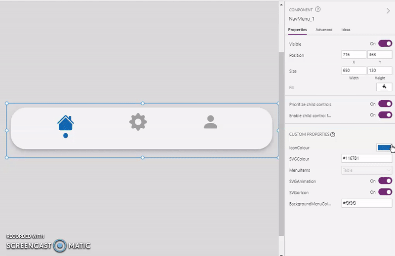
We are nearly ready to start testing!! The final touch is just adjusting the height and width of our component - please set the height to 130px, and width to 650px.

Let’s play with our component!! Please navigate to the Screens tab in your application. The on top of your screen, click on Custom, and from the dropdown choose your NavMenu component. You can also do this from the left hand pane if you click on the ‘+’ icon, whichever you prefer.

When we first add our component to the screen, it will look very dull! Please don’t be put off.

Mission complete!! 🤩We are ready to start changing colours etc. Please watch the short video below on how I’ve adjusted my menu, please however feel free to make it whatever you want!
I’ve used the following:
IconColour: RGBA(33, 134, 140, 1)
SVGcolour: #21868C
BackgroundMenuColour: #f3f3f3

Well done on getting this far and completing this short mobile navigation series. Season 2 coming soon 😉
I’d love to see what results you have achieved and how you customise your menu!🙌