
PowerHack🔮 #4 How to elevate your Gallery UI with only 1 simple property!

Welcome to my fourth PowerHack🔮! Hope you are enjoying this series so far and thank you for being here!
In today’s episode, we will look at how to quickly elevate the look of your gallery with ONE property of a control. Now if you know me, or have read my previous blog posts, you’ll know what I’m just about to say…

Credit: Daryl LaBar who made this during our podcast and it couldn’t be any more true😂
Yes, I know. WHY WHY WHY?! Because box-shadow is everywhere. It is prevalent in nearly every modern design framework - Fluent UI, Skeumorphism, Neumorphism, Aurora UI, Claymorphism, Neubrutalism, Material Design and many more. When done well, it can truly elevate your application or website by providing depth, contrast and clarity to the page. They are aesthetically pleasing but at the same time really useful in differentiating elements on your page. You can even imitate neon lights using box shadow. Super cool, right?!

Bud don’t get me wrong - if overdone - it can be very distracting and extremely unhelpful for your users. Please be mindful of that!
Let’s dive right into today’s hack. If you’ve read one of my previous posts, you’ll know that in order to add box shadow, we can use either a HTML control or an SVG (in SVG’s this is called drop-shadow). For today’s post, we will use the HTML control. Firstly, let’s add the HTML control to our screen.

Now let’s add a very simple <div> element. I want the width to be 380px and the height to be 350px to create a rectangle but please feel free to use the measurements of your choice! To do this, we will implement inline styling within the div element. The syntax looks like this:
"<div style=' our styling goes here '> </div>"
And here’s the complete snippet for our simple div:
"<div style='
width:380px;
height:350px;
'>
</div>"
Now please don’t worry - you won’t be able to see anything on your screen yet as we haven’t given the div any background colour!
Now’s time for the box shadow! Before we start working on the box shadow, let’s understand the syntax a little bit more:
box-shadow: [horizontal offset] [vertical offset] [blur radius] [optional spread radius] [color];
horizontal offset - positive means the shadow will be on the right of the box, a negative offset will put the shadow on the left of the box. This is required, if you don’t want any horizontal offset, you need to set it to 0.
vertical offset - a negative one means the box-shadow will be above the box, a positive one means the shadow will be below the box. This is also required, if you don’t want any vertical offset, you need to set it to 0.
blur radius - if set to 0 the shadow will be sharp, the higher the number, the more blurred it will be. This is also required, if you don’t want any blur radius, you need to set it to 0.
optional spread radius - positive values increase the size of the shadow, negative values decrease the size. This is an optional property and you don’t need to declare it.
color - this will be the colour of our shadow. This is a required property.
No, you didn’t need to know all that 😜 Now, you can certainly write box shadow by hand and find the best fit for you, however a lot of developers and designers use online generators to speed the process up. You can use one of these if you’d like to generate your own shadow. For today’s session, we will use pre-generated shadows from this website.
When we open the website, we are greeted with 93 different box-shadows that we can just copy and paste into our projects. Amazing!!

All you need to do to get the box shadow, is just click on one of the boxes and it will automatically copy it into your clipboard. You can then paste it directly into your HTML control. Here’s a quick demo:

And the snippet for the box shadow I’ve used:
"<div style='
width:380px;
height:350px;
box-shadow: rgba(50, 50, 93, 0.25) 0px 13px 27px -5px, rgba(0, 0, 0, 0.3) 0px 8px 16px -8px;
'>
</div>"
Now, as soon as you’ve done that, you can see the ugly cut off corners. The reason why is because the box shadow extends the borders of your HTML control. To fix this, all we need to do is add a little margin to create some space around the edges. Now we can either use margin-top, margin-right, margin-bottom and margin-left or just use the shorthand margin and declare all 4 edges in one line. For today’s demo, we will use the latter.

Don’t let your box shadows look like this!
For our specific box-shadow, we will only need to use a margin of 25px. Please note that if you selected one of the box shadows with more blur spread, you’ll need to adjust the margin accordingly. Let’s add margin: 25px, some white colour with a little bit of transparency and also some border radius. This will produce the following snippet:
"<div style='margin:25px;
background: rgb(255,255,255,0.7);
width:380px;
height:350px;
border-radius:15px;
box-shadow: rgba(50, 50, 93, 0.25) 0px 13px 27px -5px, rgba(0, 0, 0, 0.3) 0px 8px 16px -8px;
'>
</div>"
And here’s our result:

Now, let’s have add this to our gallery. I am going to use the sample food app I’ve showed previously. Firstly, let’s right click on the HTML control (or CTRL + C) and click on Copy.
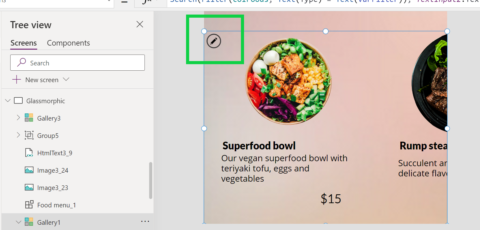
Navigate to the screen where you have the gallery sorted out and select it. When you click on your gallery, a black pencil will appear to the top left as you can see below - please click on it to start editing your gallery.
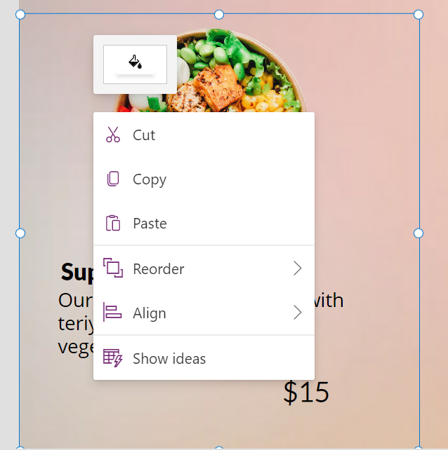
Now right click, and click on paste to add the HTML control to your Gallery. To paste, you will need to use CTRL + V as right clicking and pasting will not insert it within the Gallery.
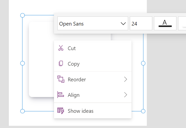
When you do this, it will overlap everything else you have in your Gallery, so please right click on the control, and then Reorder, and then select ‘Bring to front’. You’ll also need to position your HTML control to fit wherever you want it to fit.
And here’s a quick GIF of how to add this to the Gallery step by step. Alternatively you can just add the HTML control directly to the Gallery and then start editing it from there!

Voilla! 😍Here’s the result:

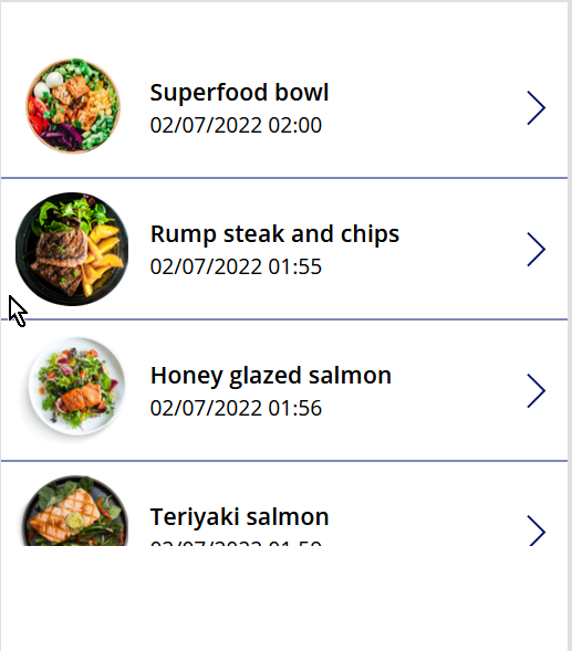
Hopefully you’ll agree that it looks a little bit better than this (it’s okay if you prefer this design by the way!):
And another example - in this case, I’m using a slightly different design framework. Same app, and the only attributes that are different is the box-shadow property and background colour. Hopefully you can now see how powerful box-shadow is!

And here’s the snippet for the above screenshot because sharing is caring 😊
"<div style='margin:15px;width:100px;height:350px;
width: 90%;
  max-width: 440px;
background-color: rgba(255, 255, 255, 1);
border-radius: 20px;
box-shadow: 10px 5px 15px 0px rgba(0, 79, 186, 0.5), inset -8px -8px 16px 0px rgba(0, 79, 186, 0.6), inset 0px 11px 15px 0px rgb(255, 255, 255);'>
  </div>"
I hope you enjoyed this quick hack! Please don’t forget to hit the subscribe button below if you’d like to get updates on my future posts. I also have a YouTube channel coming up very shortly so please stay tuned if you’d like to see more of my content! 😊