
Building a beautiful Power Apps mobile navigation menu - HTML control(part 1)
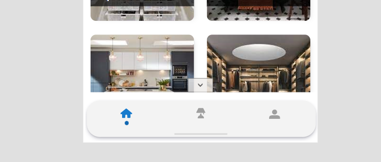
If you didn’t know already… I love UI and UX. I recently tweeted a snapshot of a mobile navigation menu I have built for one of my Power Apps which gathered a lot of interest. I promised I would show you step-by-step how to do it so here we are - welcome to Part 1!
The actual menu comprises of a few elements layered on top of each other, some of them are classed as slightly more advanced, and I thought it would be a good idea to split this tutorial into smaller chunks and deep dive into each one of the parts in more detail.
This series will include:
Part 1 - the menu background using a HTML control,
Part 2 - Creating the menu items using a gallery,
Part 3 - Swapping the static icons to SVG’s,
Part 4 - Creating a reusable components from the elements we’ve built in previous parts.
Please do not worry if you’re not familiar with using a HTML control or SVG’s - I will go over this in as much detail as possible to make it easy to understand regardless of your background knowledge. This menu component will also be shortly available on my GitHub for anyone to reuse.
To build the base of our control, we are using the HTML control. HTML control is a fantastic way to inject additional styling using inline CSS that you would not otherwise be able to achieve natively in Power Apps. My journey with the HTML control started a couple of years back when I saw a blog post from the amazing Geetha Sivasailam and what she achieved with it - I totally recommend you see this article if you haven’t already. And then the legendary April Dunnam released a YouTube video on the HTML control too and I knew I had A LOT of experimenting to do to see how far I can push the boundaries.
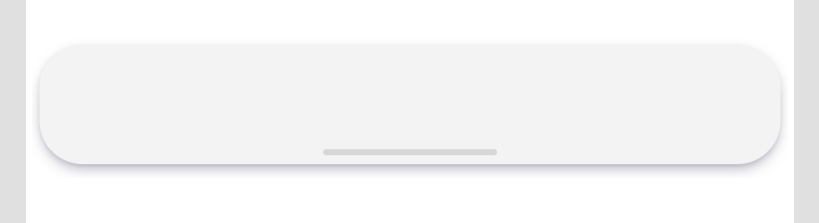
Our baseline control will look like the below. A bit of box shadow, a bit of border radius, and it’s ready! As a pro tip, I’ll also show you how to achieve gradient effect!
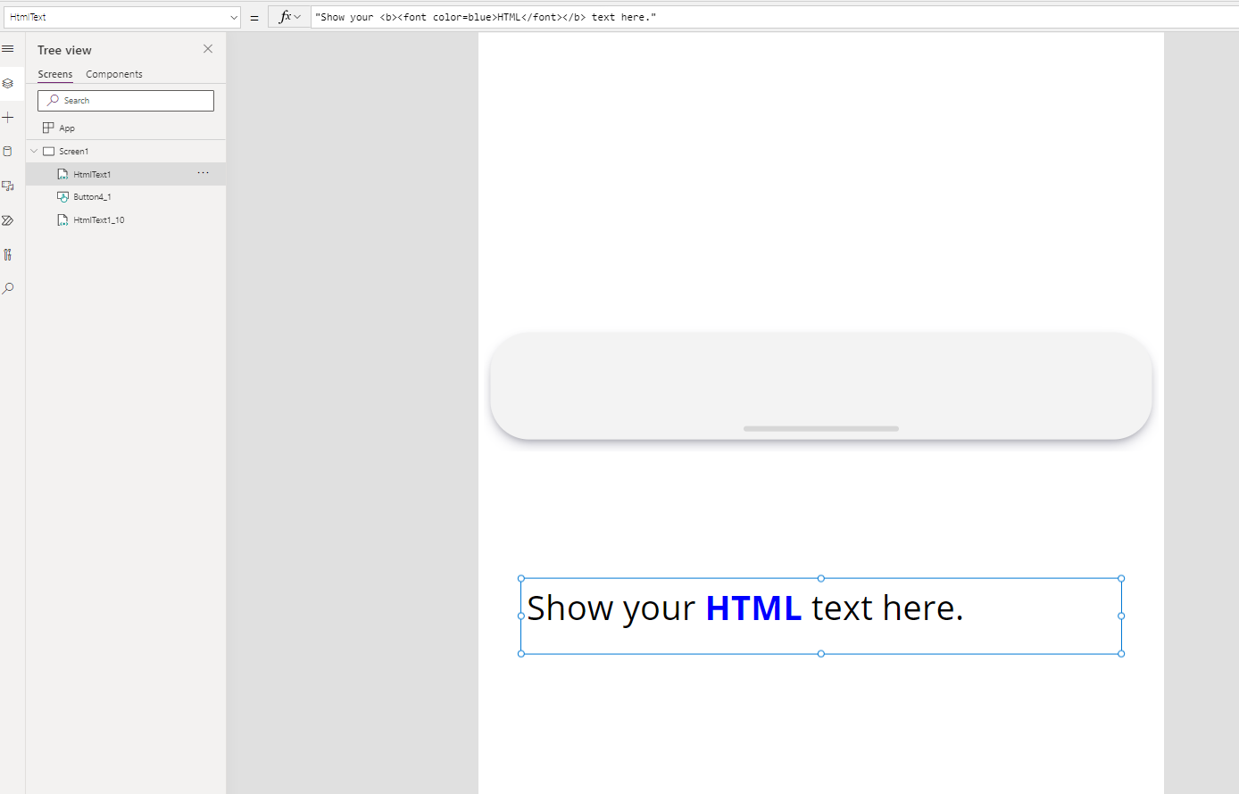
To start with, we need to add the HTML control to our canvas (it works seamlessly in both the full version of Power Apps maker studio as well as the Teams version). You will then be greeted with some default text. As it is a HTML control, the text itself has some inline formatting applied to it.
<"Show your <b><font color=blue>HTML</font></b> text here."
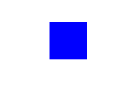
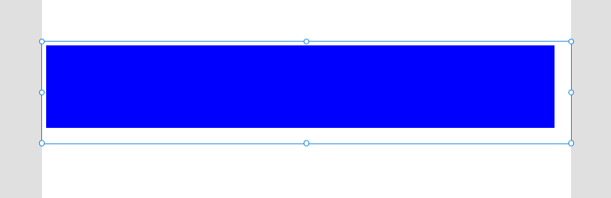
In order to add a ‘box’, we need to insert a simple <div> tag to our code. Because the background of my app is white, I have temporarily set the colour of the box to blue.
"<div style='width:100px;height:100px;background-color:blue'></div>"
Once you’ve added the code below, your control should look like this:
Now we have the <div>, we are halfway through! Firstly, let’s set the size of our control - for this menu, I am setting the width to 615px and height to 100px. You can set it to whatever you want - the reason why I’m leaving space between the sides is because we will be adding drop shadow to the control.
"<div style='width:615px;height:100px;background-color:blue'></div>"
It looks a bit off centred - don’t worry, we fix that later on!
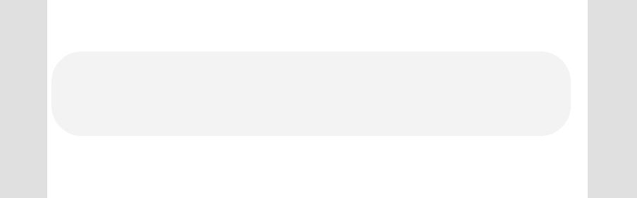
Now, let’s give our control some colour and change the border radius. The colour I’m using in my menu is a slightly transparent grey of the following values rgb(196,196, 196, 0.2). You’ll see in my future posts that I use this colour a lot! To set the border radius of the control, we use the border-radius property. For our control, this will be 36px for all corners, however if you’d like to set them to be different for various corners, you’ll need to add extra values. In HTML, we specify we go in this order - top, right, bottom, left. So if you’d like to have different border-radius for each corner, you could do border-radius: 1px (top left) 2px (top right) 3px (bottom right) 4px (bottom left). For our control, we want the border radius to be identical for all 4 corners.
"<div style='width:615px;height:100px;background-color: rgb(196,196,196, 0.2) ; border-radius: 36px'></div>"
We are nearly there!
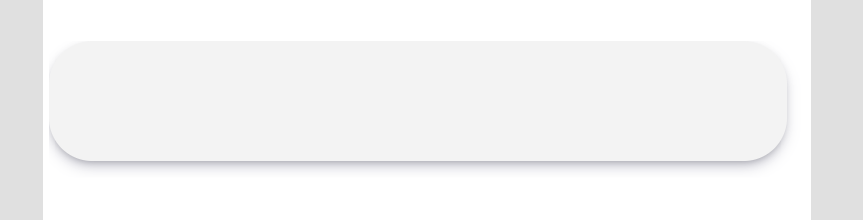
Now, let’s add some extra oomph to our control with drop shadow. Adding drop shadow is one of my favourite things to do in Power Apps as it instantly takes your UI to next level and adds some depth to it. To do this, we are adding the box-shadow property to our <div>. For my control, I’m adding the following box shadow box-shadow: rgba(50, 50, 93, 0.25) 0px 6px 12px -2px, rgba(0, 0, 0, 0.3) 0px 3px 7px -3px, but feel free to modify it if you’d like more depth, blur, offset or even different colour. If you’re ever stuck for ideas for a pretty box shadow, have a look through this website. There are some awesome box shadows available there that you can just copy and paste into your control without writing the code yourself.
"<div style='margin:6px;width:615px;height:100px;background-color: rgb(196,196,196, 0.2);box-shadow: rgba(50, 50, 93, 0.25) 0px 6px 12px -2px, rgba(0, 0, 0, 0.3) 0px 3px 7px -3px
; border-radius: 36px'></div>"
We are nearly there!
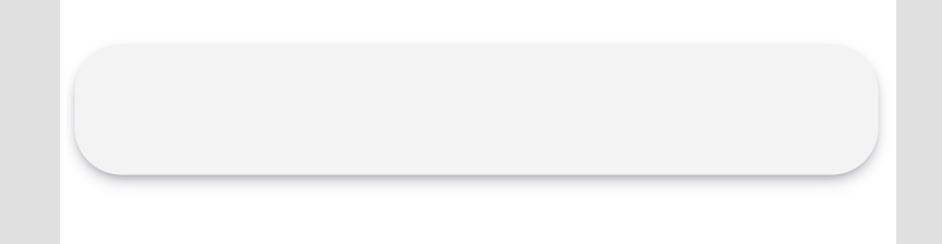
You’ll notice that the box shadow to the left is slightly cut off. This is because the blur is wider than the viewport of our HTML control resulting in the cut-off line. In order to fix this, we just need to add the margin property to our control to create some space around the borders. For this control, we will add margin of 6px. If you want to ensure it is centrally aligned, please also add the justify-content property to your control.
"<div style='justify-content: center; margin: 6px; width:615px;height:100px;background-color: rgb(196,196,196, 0.2) ; box-shadow: rgba(50, 50, 93, 0.25) 0px 6px 12px -2px, rgba(0, 0, 0, 0.3) 0px 3px 7px -3px
;border-radius: 36px'></div>"
Looking pretty awesome, right?!
The last, and final touch, is the bar on the bottom of the menu. Now, there are two ways of achieving it. We can either deep further into HTML or add an out of the box rectangle/button. I’ll show you both ways just for fun!
There are many ways to align divs - flexbox, justify content and more depending on the outcome and some other properties. For today’s demo, we will use the transform property and use the inline CSS position, top and left properties. To add a div within a div, we simply have to open a <div> within the existing one. As with the parent div, we need to give our div some colour, width, height and border-radius.
"<div style='position:relative; justify-content:center;margin: 6px; width:615px;height:100px;background-color: rgb(196,196,196, 0.2) ; box-shadow: rgba(50, 50, 93, 0.25) 0px 6px 12px -2px, rgba(0, 0, 0, 0.3) 0px 3px 7px -3px ;border-radius: 36px'>
<div style='position:absolute; top: 90%; left:50%; transform:translate(-50%, -50%); width:150px; height:3px; background-color:rgb(196,196,196, 0.7); border-radius: 36px' </div>
</div>
"
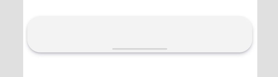
Version with inline CSS
You can achieve the same by adding a button to your screen (make sure the DisplayMode property is set to Disabled), set the width to 150px and height to 4px, change the fill to RGBA(196,196,196, 0.7) [I TOLD YOU I LIKE THIS COLOUR! 😊] and then place it in the middle of your property (ideally you’ll use the X and Y to perfectly align it to the centre.
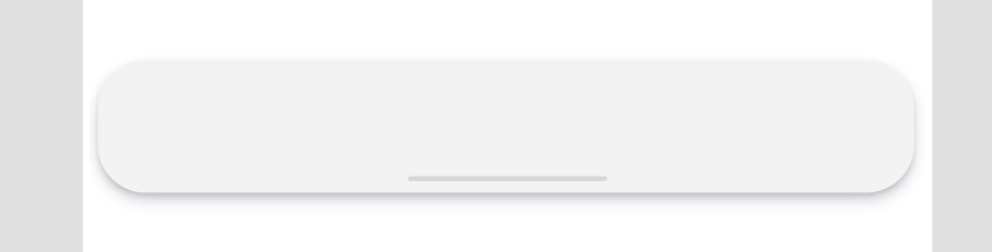
Voilà! Doesn’t it look so cool?!
As promised, I’ll also show you how to add gradient to your HTML control. To do this, we will be using the background-image property. If you’re not sure how to create a gradient, or you’re not feeling creative with colours - here’s a fantastic website that has some pretty beautiful lineal gradients available that you can just copy and paste into your app. Here’s a code snippet and the result.
"<div style='position:relative; justify-content:center;margin: 6px; width:615px;height:100px;background-color: rgb(196,196,196, 0.2);background-image: linear-gradient(to right, #355c7d, #6c5b7b, #c06c84); box-shadow: rgba(50, 50, 93, 0.25) 0px 6px 12px -2px, rgba(0, 0, 0, 0.3) 0px 3px 7px -3px ;border-radius: 36px'>
<div style='position:absolute; top: 90%; left:50%; transform:translate(-50%, -50%); width:150px; height:3px; background-color:rgb(196,196,196, 0.7); border-radius: 36px' </div>
</div>
"
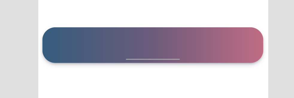
Now… that’s pretty stunning isn’t it?! 🤩
That’s it for today! I hope you’ve learned something new about the HTML control (and hopefully about HTML too!). Let me know what you think!
See you soon for Part 2! If you don’t want to miss it, please make sure you subscribe to my blog alerts below!